PLAZA Tools
For a navigation overview of the different tools and how to reach them, click here.
Gene family evolution
Expansion plot
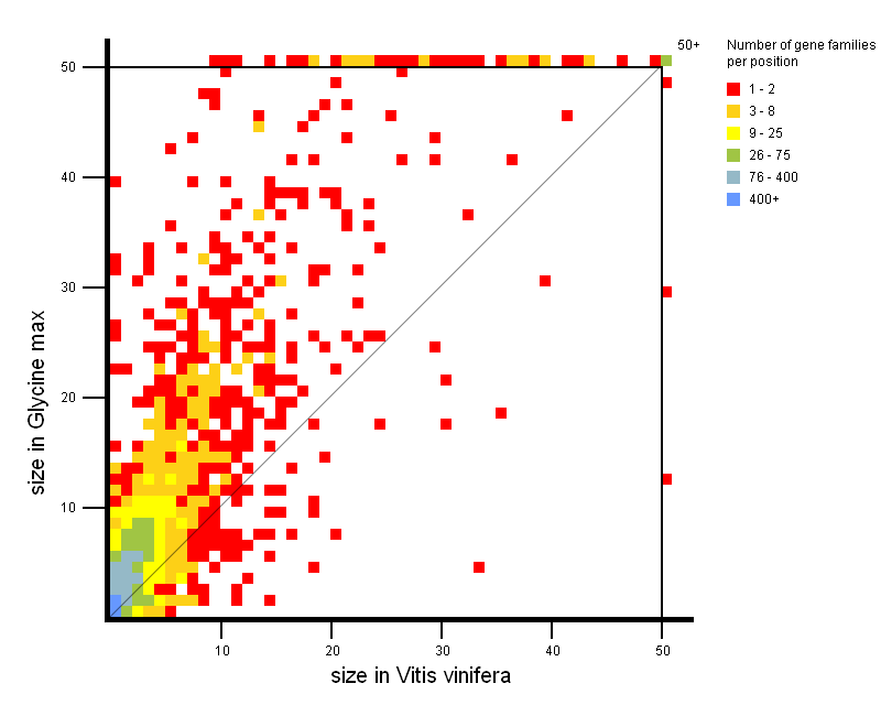

- Tool to explore the copy-number gene family variation between two groups of species.
- Easily detect gene family expansions between two groups of organisms (each group contains one or more organisms). Thus it is easy to explore gene families with a large copy number in one phylogenetic clade compared to another phylogenetic clade. For each small square in the expansion plot, there is a corresponding copy number in organism group 1 (X-axis) and a corresponding copy number in organism group 2 (Y-Axis), respectively. The color of the square indicates how many gene families in PLAZA have those copy numbers in organism group 1 and 2 (see legend on figure). As such, squares with a large X-value and a low Y-value are expanded gene families in organism group 1, while squares with a large Y-Value and a low X-value represent expanded gene families in organism group 2. Squares situated around the diagonal can be considered not to be expanded.
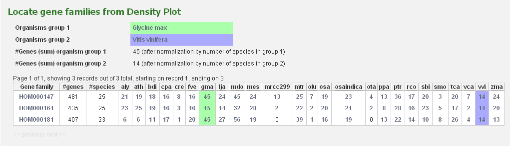
All squares on the expansion plot are clickable and redirect to a table with the selected gene families.
As such, it is easy for the user to have a closer look at the gene families of interest.
This tool can be considered to be complementary to the Gene Family Finder Tool.
-
Parameters:
- Maximum drawing size: Gene families with a too large copy number in either organisms group 1 or 2, are displayed on the outer border of the Expansion Plot. By increasing the maximum drawing size the range of axes is increased, leading to a decreasing number of squares on the border.
- Normalize by number of selected species: When there is more than 1 species in either organism group 1 or 2, it becomes clear that comparing gene families purely on copy number introduces a bias towards the group with more organisms. Therefore the gene family copy number of the organism groups can be adapted so it averages over the number of species in that group.
- Use only gene families where the selected species are all present: If selected, only those gene families, which have a representative gene of each organism of both groups, will be displayed. Otherwise a single representative gene from each group will suffice to include the gene family. Selection of this option will result in a smaller set of gene families.
- Use only gene families specific to the selected species: If selected, only those gene families which have only representative genes from the selected organisms, will be displayed. Selection of this option will result in a smaller set of gene families.
- This tool can be found at Analyze → Expansion plot.
Gene family expansion analysis
- This page provides an overview of how expanded the copy number of genes from each species are, within a gene family.
- Using the same approach as the Gene Family Finder tool (Find species/clade-enriched gene families), this page uses the ratio of the copy number of a species (within a gene family) compared to the overall proteome size to evaluate whether an expansion for that species has occurred.
- This method works well for multi-copy gene families, but single-copy gene families (in which each species has only 1 ortholog) might be incorrectly interpreted, as the species with the smaller proteome size will automatically be indicated as being depleted within that gene family.
- Expansions are indicated with a ratio higher than 1, depletions are indicated with a ratio between 0 and 1. An adapted color-scheme makes it easy to compare expansions and depletions (light colors indicate minimal expansions/depletions, intense colors indicate heavy expansions/depletions).
- This tool is accessible from each gene family page
Gene family finder
- This tool enables to identify (expanded) gene families specific to one or more species.
- The Gene Family Finder tool consists of two separate search functions: an option to find species/clade-specific gene families and an option to find species/clade-expanded gene families.
Find species-specific gene families
-
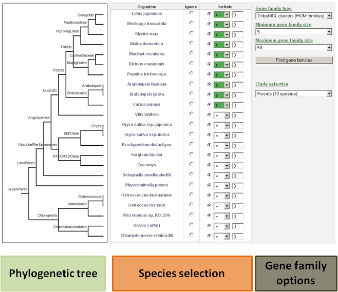
The user has the ability to detect specific gene families based on phylogenetic profiles (presence or absence of a gene family in a species).
For each species, the user can decide to include that species in the search, or to ignore it.
It is important to make the distinction between setting the expected gene copy number for a species to zero or ignoring that species in the search.
When the species is included, the gene copy number for that species will be evaluated. If that species is ignored, the gene copy number for that species is not evaluated.
- For example: If a user wants to view only the Arabidopsis thaliana specific gene families, then the include button for all species should be selected (together with value 0), and only for Arabidopsis thaliana the equal sign (=) should be changed to the greater-than-sign ( > ). This way, the database will know to select only these gene families for which the gene number of each species is zero, except for Arabidopsis thaliana.
- Clade-specific gene families can be found by manually selecting the species and their expected gene copy number, or by using the drop-down selection menu including pre-defined clades. Further options and refinements to the search are still possible at that time.
Find species/clade-enriched gene families
- This tool allows the user to select one or more species, and find the gene families where the copy number for the selected species is higher than would be expected. The expansion ratio denotes, for a specific species, the fraction of genes in a gene family over the fraction of proteins (for that species) in the total PLAZA proteome.
- For example: the Arabidopsis thaliana proteome makes up 3.5% of the PLAZA 2.5 proteome. A valid search for Arabidopsis thaliana expanded gene families could be one where the Arabidopsis thaliana gene copy number makes up 35% of the gene family size. In that case it could be said that said gene families are 10x enriched for Arabidopsis thaliana.
- Options include selection of the expansion ratio (compared to full proteome set), and the minimum and maximum number of genes in the gene families.
- Both tools can be found at Analyze → Gene Family Finder or from a species (or phylogenetic clade) page
Integrative orthology viewer
- Tool to explore for a query gene the orthologous genes in other species using different evidences for orthology.
- The viewer displays for a query gene all orthologous genes (detected by the various methods), with the support of the methods for each orthologous relationship displayed by the completeness of the polygon. Also, the inparalogs of the query gene (and the orthologs of those inparalogs) are displayed as well, in order to identify possible many-to-many orthologous relationships. The query gene is indicated by the black band in the Integrative Orthology Viewer.
- Clicking on the polygon representing the support for the orthologous relationship gives the user the possibility to view the support for that orthologous relationship in an in-depth manner.
- The Integrative Orthology Viewer can be accessed through a gene page
Integrative orthology viewer

- Tool to explore for a query gene the orthologous genes in other species using different evidences for orthology.
- The viewer displays for a query gene all orthologous genes (detected by the various methods), with the support of the methods for each orthologous relationship displayed by the completeness of the polygon.
- For each relationship, the following gene sequence features are also compared: CDS length, number of exons and GC content. These are shown at the bottom of the polygon, displayed by pie charts.
- The inparalogs of the query gene (and the orthologs of those inparalogs) are displayed as well, in order to identify possible many-to-many orthologous relationships. The query gene is indicated by the black band in the Integrative Orthology Viewer.
- Clicking on the polygon representing the support for the orthologous relationship gives the user the possibility to view the support for that orthologous relationship in an in-depth manner.
- Drop-down menus allow the user to select which orthology approach and gene feature to display, but also how many approaches to include at the same time.
- The Integrative Orthology Viewer can be accessed through a gene page
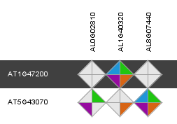
Similarity heatmap

- The similarity heatmap visualizes the similarities (bitscores) between all genes within a family.
- Use the heatmap to visualize similarities (bitscores) between all genes within one family, using different shades of green-white. If a cell is pitch black the genes aren't BLAST hits (with our settings, see Construction). Otherwhise the similarity is indicated by the color dark green is bad similarity and white is the highest similarity in the grid. This can be usefull to check the clustering or to delineate sub-groups. The genes are clustered using single linkage clustering to group similar genes in the heatmap together. Gene ids and Ortho sub-family ids can be clicked and take you to the corresponding page on the website. In case the heatmap is too large to display a slider is shown that allows users to shrink/enlager the heatmap. Additionally a gene-by-gene normalization procedure can be turned on/off.
- This tool can only be reached through a gene family page.
Similarity heatmap
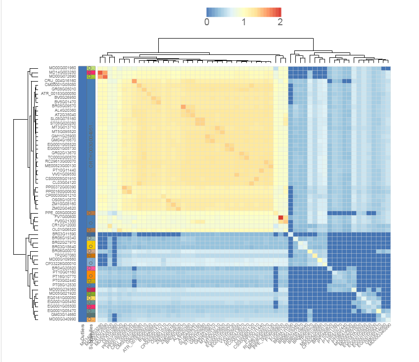
- The similarity heatmap visualizes the similarities (bitscores) between all genes within a family.
- Use the heatmap to visualize similarities (bitscores) between all genes within one family. The colorization scale is displayed on top of the heatmap, with dark blue indicating little to no similarity, and red a high degree of similarity. If the value is zero, then the genes aren't BLAST hits (with our settings, see Construction). Extra information, such as subfamilies and outlier data, is displayed on the left. Clustering and dendrogram creation is handled by the JavaScript visualization tool canvasXPress. Selection of species, as well as normalization, are new options compared to previous PLAZA versions.
- This tool can only be reached through a gene family page.
Tree explorer
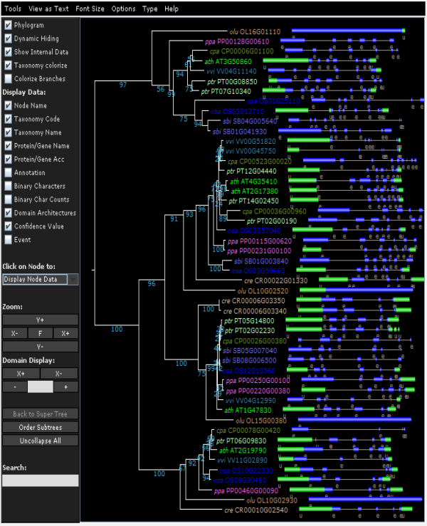
- View the phylogenetic tree of the homologous gene family.
- Using the Java applet version of Archaeoptryx trees are visualized and several features can displayed (speciation/duplication nodes, intron/exon structures and InterPro domains). For more details, check the settings page.
- Due to the editing of the multiple sequence alignment prior tree construction, some taxa showing too many gaps in the alignment or representing partial genes are discarded (cfr. 'Outlier/stripped gene information').
- The Tree explorer can be accessed through a gene family page.
Tree explorer
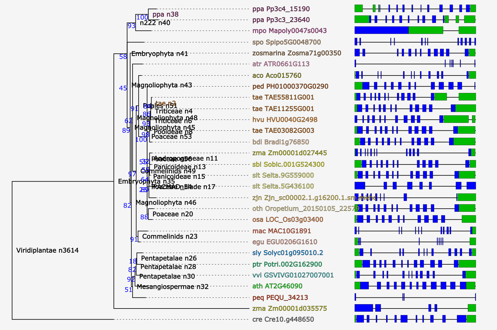
- View the phylogenetic tree of the homologous gene family.
- Using PhyD3 trees are visualized and several features can displayed (speciation/duplication nodes, intron/exon structures and InterPro domains). For more details, check the corresponding paper .
- Due to the editing of the multiple sequence alignment prior tree construction, some taxa showing too many gaps in the alignment or representing partial genes are discarded (cfr. 'Outlier/stripped gene information').
- The Tree explorer can be accessed through a gene family page.
Interactive Phylogenetics Module

- The Interactive Phylogenetics Module is meant to generate the phylogenetic tree of user-selected sequences.
- The user first inputs a seed gene or gene family identifier.
- A selection has to be made of sequences to be analyzed based on the BLAST hits of the query gene OR species-based selection based on the corresponding gene family; only one of the selection modes can be used at the same time. Also external sequences (either DNA/protein sequences) can optionally be inputted.
- The algorithm used for generation of the MSA can be either MUSCLE or MAFFT using automatic method detection. Next, the user can choose to perform no editing, removal of lowly conserved positions, filtering of partial sequences or both filtering and trimming. Finally, the phylogenetic tree construction has to be defined, which can be either the approximate maximum likelihood FastTree or the maximum likelihood methods PhyML, RaXML, or IQ-TREE. The latter will perform a test to detect the best fitting protein model from the following widely used models: JTT, LG, WAG, Blosum62, VT and Dayhoff. Thousand rounds of ultraparametric bootstrapping are run in IQ-TREE and the FreeRate model is used for rate heterogeneity across sites. All other methods use the WAG protein model in combination with 100 bootstraps and gamma approximation for modelling rate heterogeneity across sites.
- PhyD3 is used to visualize the generated phylogenetic tree. All intermediate and final files can be downloaded from the Files tab. All used commands and software versions can be displayed and finally detailed information about alignment construction and processing is visible in the Extra tab.
- The Tree explorer can be either accessed directly through Analyze → Interactive Phylogenetics Module or indirectly from a gene/gene family page.
General tools
Similarity heatmap
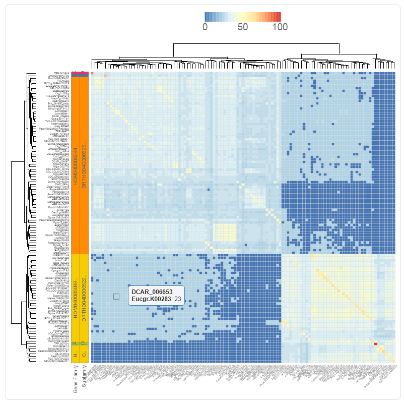
- The similarity heatmap visualizes the similarities (bitscores) between all genes of a gene set. This gene set can be either a gene family, InterPro domain, GO term, or workbench experiment.
- Use the heatmap to visualize similarities (bitscores) between all the genes of the gene set. The colorization scale is displayed on top of the heatmap, with dark blue indicating little to no similarity, and red a high degree of similarity. If the value is zero, then the genes aren't BLAST hits (with our settings, see Construction).
- Extra information, such as families, subfamilies and outlier data, are optionally displayed on the left. Clustering and dendrogram creation is handled by the JavaScript visualization tool canvasXPress. Selection of species, as well as normalization of the bitscores, are additional options for the end-user.
- This tool can only be reached through a gene family page, InterPro page, or GO page.
Genome evolution and colinearity research
Circle Plot
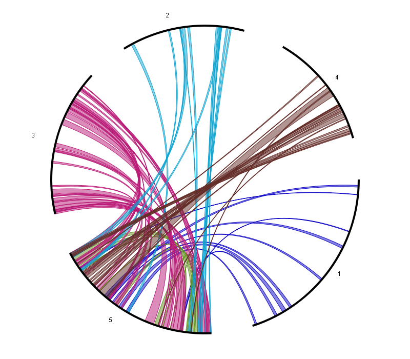
- The Circle Plot reports all colinear regions within a single species using a circular representation. This plot uses nucleotide-based coordinates instead of genes (as the smallest unit).
-
The data is the same as used for the WGDotplot (and thus generated using i-ADHoRe) while the tool is based on HTML5 canvas-drawing (with Javascript).
This allows for direct interaction with the visualization:
- Coloring options (either by Ks-value or by chromosome)
- Selection of chromosomes, which is done by selecting chromosome/scaffolds in the section Chromosome display selection. Colinear regions that start/stop at the selected chromosome will appear/disappear as well.
- Selection of colinear regions, which is done by selecting chromosome/scaffolds in the section Chromosome colinearity selection. When a chromosome is selected, then colinear regions starting/stopping in the chromosome will be displayed. When a chromosome is not selected, then colinear regions starting/stopping the chromosome will not be displayed. The associated figure shows for example the circleplot when all chromosomes (except 5) have not been selected.
-
Other options include:
- The visualization of colinear regions with other organisms on the outer border of the Circle Plot, by selecting the Add extra organisms option.
- The mapping of (coding) gene density on the outer border of the Circle Plot, making it easier to identify regions on the chromosome with low coding potential, such as centromeres.
- The mapping of genes with a specific Gene Ontology (GO) term or InterPro domain on the outer border of the Circle Plot. This can be used to identify whether certain genes are conserved within a colinear region.
- This tool can be found at Analyze → WGDotplot
Gene duplication analysis
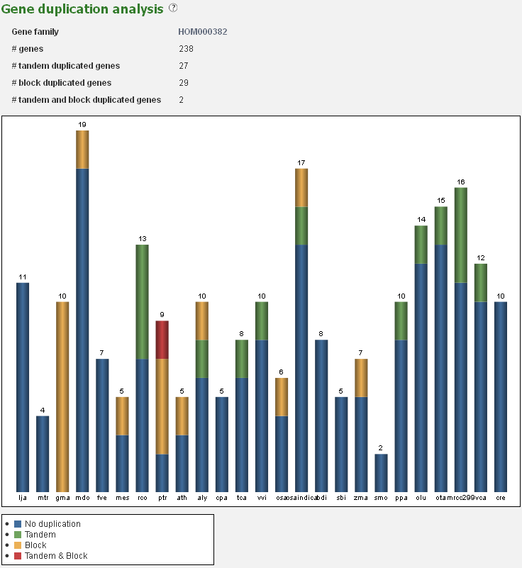
- The Gene duplication analysis page displays for a given set of genes the fraction of block and tandem duplicates.
- For a gene set (e.g. gene families, genes associated with GO terms or InterPro domains) the fraction which is determined to be duplicated (by either a tandem duplication event or a block duplication event/WGD) is reported. This analysis is displayed in a bar-chart, with the various types of duplications indicated on the page, organized per species. This is useful for examining the mode of duplication responsible for the expansions of gene copy number within a set of genes.
- This tool can be reached through each gene family page, GO term page or InterPro page, through the summary of gene duplication types displayed below the pie-chart (with number copy per species) on each page.
Ks-graphs
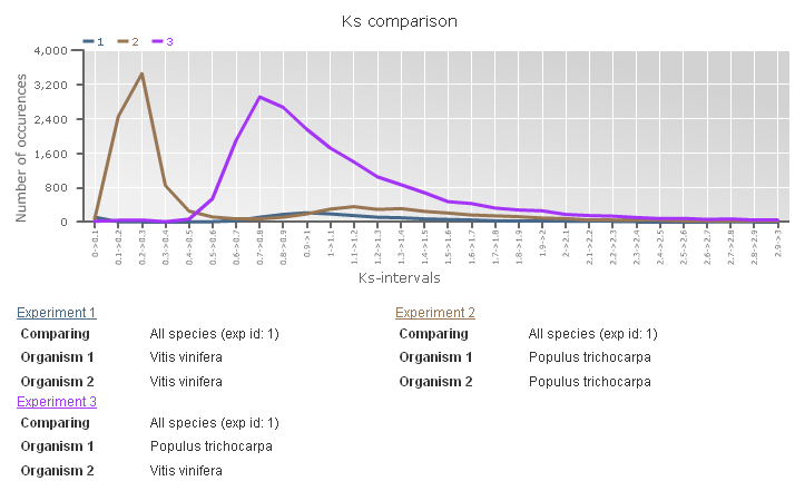
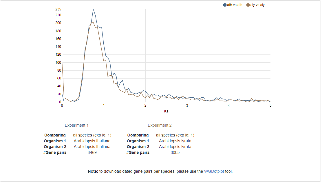
- The Ks-graphs tool allows you to overlay several Ks graphs of colinear gene pairs.
- This tool allows the user to plot histograms from Ks values for all colinear gene pairs within one species or from two species. If selected, multiple graphs can be superimposed on each other. The user is able to compare Ks values from duplication events in different organisms or Ks values from speciation events.
- This tool can be found at Analyze → Ks-graphs
Multiplicon view
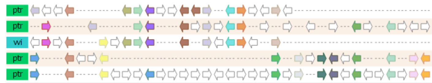
- The Multiplicon view displays the aligned gene strings of a set of homologous segments.
- Colinear segments detected by i-ADHoRe are grouped into multiplicons. These are initially pairwise (level 2) but i-ADHoRe will iteratively go through the genomes adding, if available, extra homologous segments (profile search). Below the image a list is shown with all multiplicons detected using a profile based on the current multiplicon. These segments are aligned using i-ADHoRe's greedy graph aligner.
- Clicking on a gene will allow the user to go directly to the gene page or the gene family page.
- In the advanced options box on the right side of the page different window sizes can be selected.
- This tool can be reached through the WGDotplot and the Skyline Plot.
Multiplicon view
- The Multiplicon view displays the aligned gene strings of a set of homologous segments.
- Colinear segments detected by i-ADHoRe are grouped into multiplicons. These are initially pairwise (level 2) but i-ADHoRe will iteratively go through the genomes adding, if available, extra homologous segments (profile search). Below the image a list is shown with all multiplicons detected using a profile based on the current multiplicon. These segments are aligned using i-ADHoRe's greedy graph aligner.
-
The visualization is fully JavaScript-driven, and allows for a variety of interactive options:
- Selection of species for which to display the colinear regions
- Ordering of the colinear segments in the visualization
- Whether or not to draw all genes, or only the colinear ones
- Additionally, by clicking on a gene a variety of extra information is displayed, with the necessary linkouts to allow the end-user to freely navigate the PLAZA platform to other entities of interest.
- This tool can be reached through the WGDotplot and the Skyline Plot.
Skyline plot
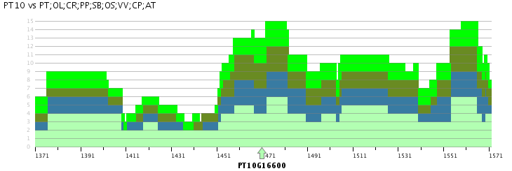
- The Skyline plot provides for a locus of interest an overview of the colinear regions within and between species.
- Starting from a query locus, the Skyline plot gives an overview of the colinear regions that exist within a set of selected species, i.e. regions between the selected species which have conserved gene content and order. This region is selected using a reference gene that should always be entered. Selection of only the organism for which the query locus was entered will provide an overview of the duplicated blocks overlapping with the query locus, while selecting other species as well will report all colinear regions. The plot will find all multiplicons that match the reference chromosome, and will check for each organism how many segments can be found together with the reference segments in one multiplicon. Each block is clickable and will take you to the multiplicon view.
- This plot can thus be used to study the number of identifiable duplications in the evolutionary history of organisms. The example Skyline Plot image for example details a maximum of six colinear poplar segments versus three Arabidopsis thaliana segments. When studying the Skyline plots on a per-chromosome basis between species the number of duplication events can as such be measured.
- Advanced options include the window size and the experiment (i.e. i-ADHoRe settings and selected species to identify gene colinearity). The window size makes it possible to report colinearity for only a small region around the query locus (50, 100, 200 or 500 genes) or for the entire chromosome (chromosome). The experiment selection makes it possible to use the output of specific i-ADHoRe runs (i.e. the method used to detect gene colinearity).
- Note that different segments in the same stack (i.e. on top of each other) can point to different multiplicons (from different species).
- Clicking on a region in the Skyline plot will redirect the user to the associated Multiplicon view, where the genes in the colinear region are detailled.
- This tool can be found at Analyze → Skyline plot
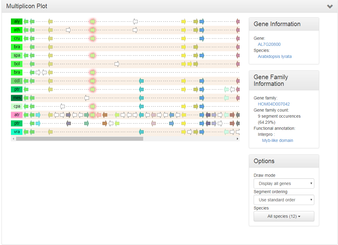
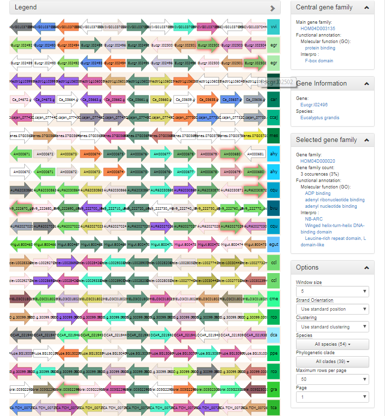
Synteny plot
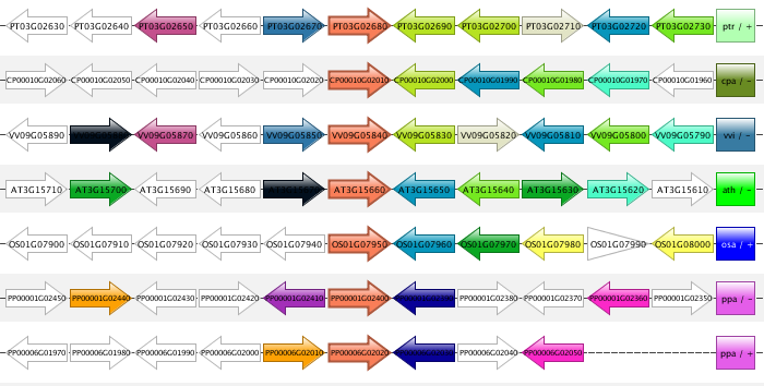
- The Synteny plot reports the local gene organization for homologous genes within a family.
- Starting from a selected family the gene organization of all homologs of that family is reported. Strand information and different gene types are indicated by arrows and other symbols (see Legend), respectively, and genes belonging to the same gene family are coded by the same color. All genes are drawn in the picture as if lying on the forward strand, which is done for easier visual comparison.
- The window size option makes it possible to change the number of genes around the locus from the selected gene family (5, 10 or 15 genes). The paginate function (right option menu) can be used to view additional genes associated with this gene family.
- All gene strings are clustered in order to display genes with a similar local gene organization in close proximity of each other (~positional homologs).
- This tool can be found at Analyze → Synteny plot
Synteny plot
- The Synteny plot reports the local gene organization for homologous genes within a family.
- Starting from a selected family the gene organization of all homologs of that family is reported. Strand information and different gene types are indicated by arrows and other symbols (see Legend), respectively, and genes belonging to the same gene family are coded by the same color.
- Functional annotation information from the gene family is always displayed, and can be easily compared to other genes/gene families by clicking on the genes in the plot.
- When hovering over a single gene, all genes of the same gene family within the same view
-
A variety of options are available to the end-user to help with the analysis of the gene family in question :
- The window size option makes it possible to change the number of genes around the locus from the selected gene family (5, 10 or 15 genes).
- The strand orientation option can be used to draw all genes on the forward strand, or use the original gene orientation.
- The syntenic regions are clustered by default by the PLAZA platform to place the most similar ones together. If required however, syntenic regions can also be clustered by species.
- Both a species and clade selection option are available, allowing the end-user to narrow down the view in order not to be overwhelmed by the large amount of data available.
- The end-user can set both the number of syntenic regions on a single page, as well as select the page to be displayed.
- This tool can be found at Analyze → Synteny plot
WGDotplot
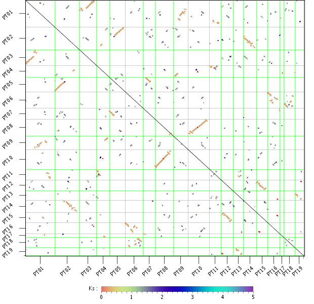
- The WGDotplot reports in a pairwise manner all colinear regions between and/or within species.
- Starting from the selected species the WGDotplot gives a graphical overview of the gene colinearity identified using i-ADHoRe. Similarly, selecting the same species reports all duplicated blocks found within the genome (intra-species comparison). If available, the age of the block paralogs determined using Ks is report using a color code. Clicking a specific cell in the dotplot gives a more detailed view of the colinearity between the two selected chromosomes. Finally, clicking on a colinear region returns the gene order alignment (~multiplicon) of these colinear regions. In this Multiplicon View, you have the possibility to click through to higher level multiplicons, detected using a profile build from the current multiplicon (i-ADHoRe).
- Note that due to i-ADHoRe's tandem remapping some chromosomes might appear to have a slightly smaller number of genes then in the actual annotation. See the FAQ for more details.
- The second plot 'Chromosome mapping of colinear regions' displays the location of the colinear regions on the chromosomes using a nucleotide-based scale (compared to a gene-based scale in the upper panel).
- If defined for the selected species, the artificial concatenated chromosome 00 (more info in Construction) is excluded from the dotplots.
- There are two versions of the WGDotplot available: the standard version (which uses an HTML clickable map) and the Java Applet version. The standard version supports the display of colinear regions between two species, while the interactive Applet version has no restrictions on the number of species.
- The Java Applet provides intuitive functions to hide and rearrange the position of chromosomes (drag chromosomes name), adapt color usage (Settings meny) and use stepless zoom features to browse genomic colinearity between multiple species (scroll with mouse).
- In the standard version, the second plot 'Chromosome mapping of colinear regions' displays the location of the colinear regions on the chromosomes using a nucleotide-based scale (compared to a gene-based scale in the upper panel).
- If defined for the selected species, the artificial concatenated chromosome 00 (more info in Construction) is excluded from the dotplots.
- There are two versions of the WGDotplot available: the standard version (which uses an HTML clickable map) and the JavaScript version.
- The interactive JavaScript version allows for the seamless zooming of colinear regions, while also offering more interactivity with regards to the display of additional information and linkouts.
- In the standard version, the second plot 'Chromosome mapping of colinear regions' displays the location of the colinear regions on the chromosomes using a nucleotide-based scale (compared to a gene-based scale in the upper panel).
- This tool can be found at Analyze → WGDotplot
Localization
Functional clustering
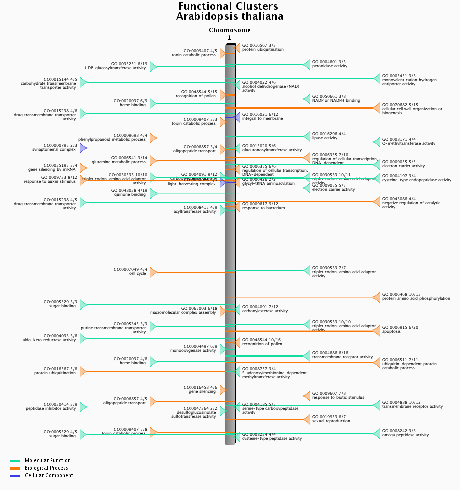
- Physical clustering of functionally related genes.
- Functional clusters of genes were detected using C-Hunter using all gene-GO annotations. C-Hunter was run with different settings (check settings here) and the results are stored as different experiments.
- The functional clustering visualization tool gives an overview of the location and content of each functional cluster on a chromosome-wide scale. Each cluster in the image is clickable and redirects to an overview page of the cluster, detailing the genes present in the cluster as well as their associated gene families.
- This tool can be found at Analyze → Functional clusters.
WGMapping
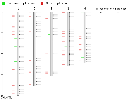
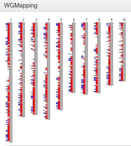
- The Whole Genome Mapping tool displays the organization of a set of genes on all chromosomes of a selected species.
-
The WGMapping tool has 2 different modes of operation. Either all genes are selected and displayed on the chromosomes of the species, and then the gene type (either coding, rna, TE or pseudo) is displayed. In a second mode the user defines a gene set (using either GO label, InterPro domain, Reactome pathway, gene family or workbench), and then those genes are displayed on their respective locations on the chromosomes. Additionally, the type of duplication (block or tandem, if applicable) for those genes is also displayed. See also FAQ Block/Tandem duplicates.The user defines a gene set (using either GO/MapMan label, InterPro domain, gene family or workbench) and selects a species; these genes are then displayed in their respective positions on the chromosomes. As an option, duplication information (block or tandem, if applicable) for those genes can also be displayed (see FAQ Block/Tandem duplicates). As you hover over it, each gene identifier is shown, along with its exact position. Additionally, by clicking on the single chromosome, this is displayed horizontally and can be explored in greater detail.
- Because not all species have their annotated genes gathered in chromosomes, but rather scaffolds, this tool might be less suitable for some of those species. To circumvent this problem, we therefore display all genomic regions (covering a selected gene) sorted according to chromosome or scaffold length.
- This tool can be found at Analyze → WGMapping. Alternatively, it can be started from your workbench (Analyze → Workbench), where it can be used to map all genes from an experiment. Other pages representing sets of genes (Gene Ontology, InterPro, Gene Family) also provide direct links to this tool.
Workbench
Toolkit included in PLAZA that allows researchers to perform analyses on user-defined gene sets.
GO enrichment
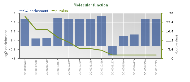
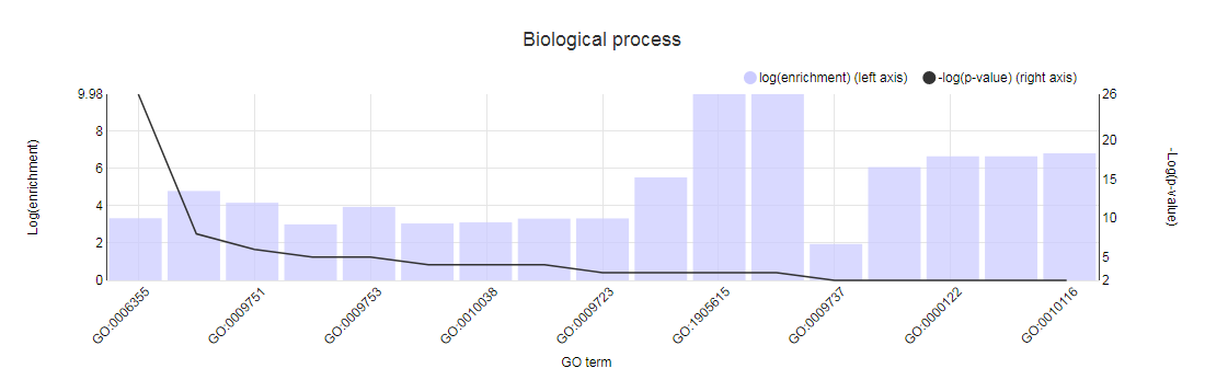
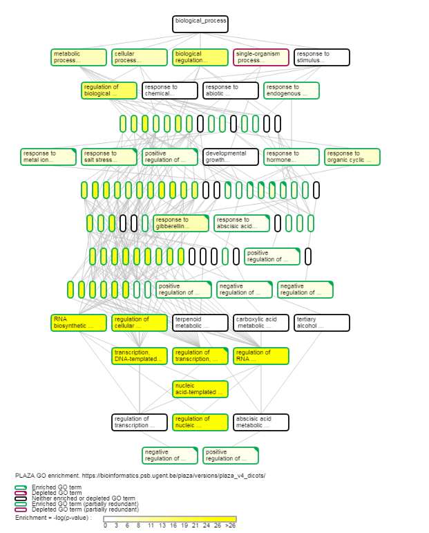
- Determines the over-representation of a certain GO term in a gene set compared to the genome-wide background frequency.
- For a selected gene set it might be relevant to know if these genes have a related function or are involved in a specific biological process. This analysis can be done for the genes in your workbench using the GO enrichment tool. This tool will compare the occurrence of a certain GO label in a gene set (~workbench experiment) with the occurrence in the genome. The significance of over- or under-representation is determined using the hypergeometric distribution and the Bonferroni method is applied to correct for multiple testing. Note that enrichment folds are reported in log2 scale (e.g. value = 1 is two-fold enriched; value = -1 is two-fold depleted); in order to have the non-transformed enrichment/depletion values, use the power-operation (e.g. 2^1=2 : two fold enrichment; 2^-1=0.5 : two fold depletion).
- In the table output, GO terms flagged with 'Shown = X (no)' refer to parental terms showing less significant results compared to their related child terms, which will have 'Shown = V (yes)'.
- Additionally, the GO enrichment page offers linkouts to the graph-representation of the enriched/depleted GO terms per GO category.
- It is important to note a difference between PLAZA v1.0/v2.0/v2.5 and PLAZA v3.0 and higher: in the older PLAZA versions the ratios were computed using all genes, while in the newer PLAZA versions we used only the genes which have any associated GO term. This difference in starting conditions might cause some differences in output between the PLAZA versions.
- This tool can only be found on the workbench (Analyze → Workbench log-in required) in the toolbox on the experiment overview page.
Orthologous genes retrieval
Using the PLAZA integrative orthology method
- Retrieval of orthologous genes through the PLAZA integrative method provides a comprehensive way of finding, for a set of genes, orthologous genes in another species. The integrative method combines multiple methods (evidence types) to predict orthology.
-
These basics need to be taken when searching for orthologous genes:
- Select the source species. This list is limited by the genes present in the workbench experiment gene set.
- Select the target species. Orthologous relationships are defined as being between 2 species.
- Select the appropriate orthologous relationship(s). When a gene has no paralogs and only 1 ortholog, this is a 1-1 orthologous relationship. This type of relationship is highly advantageous for the transfer of functional assessments between different species. Similarly, when a gene has 1 or more paralog(s) and only 1 ortholog, this is an N-1 orthologous relationship (N is implied to be larger than 1). Considering different scenario's, this leads to four different orthology relationship types: 1-1, N-1, 1-N, M-N. Selection of one or more of these types will result in the corresponding types of orthology relationships to be included in the output.
- Select the accepted evidence types. The PLAZA integrative method is based on the combination of different methods for orthology detection. Selection of these evidence types will result in the corresponding genes to be accepted as orthologs. When an evidence type is not selected, then data associated with this evidence will simply be ignored.
- Select the minimum number of evidence types which are required for an orthologous relationship to be acknowledged. This number will also be used to determine the paralogous relationships (which are needed to determine what kind of orthology types are present).
-
For example, say gene A1 is orthologous with gene B1 and gene B2.
- The supporting evidence types for the A1-B1 orthologous relationship are a)Colinearity b)Orthologous gene family c)Best-Hits-and-Inparalogs (BHI).
- The supporting evidence types for the A1-B2 orthologous relationship are a)Orthologous gene family b)Phylogenetic tree inference.
- With the standard settings (all orthologous relationship types allowed, all evidence types taken into account, minimum number of required evidence is 1), then the result would be a 1-N (1-2 actually) orthology relationship between A1 and B1,B2. However, it is clear that B1 has more supporting evidence than B2, for their relationship with A1. Therefore, when putting the minimum required evidence types at 3, the A1-B2 relationship will not be taken into account, and a 1-1 orthology relationship between A1-B1 will be the result.
- This tool can only be found on the workbench (Analyze → Workbench log-in required) in the toolbox on the experiment overview page.
Using the PLAZA gene families
- Retrieval of orthologous genes using the PLAZA gene families is a simpler version where orthologous genes are retrieved based on a copy-number filter (M and N for target and source species, respectively) using homologous gene families.
- This tool can only be found on the workbench (Analyze → Workbench log-in required) in the toolbox on the experiment overview page.
Transfer of workbench experiments
- It is possible to transfer workbench experiments between different PLAZA versions.
- This feature is available on the experiments page of the workbench, after the user has logged in.
- Mapping between gene identifiers is done by utilizing the Gene Identifier Conversion tool
Other
- Tool that allows users to visually inspect the genomes, with various features mapped onto the raw sequence.
-
To browse the raw genomic sequence and visualize various features (e.g. gene models) users can chose from 2 distinct genome browsers:
- AnnoJ: this is a HTML5 browser based interactive genome browser which allows users to pan/zoom the sequence and associated features without reloading the page.
- GenomeView : this is a Java based interactive genome browser, which has more features than AnnoJ, but requires a longer loading time.
- This tool can be found on the organism pages. Alternatively a gene of interest can be visualized in the genome browser through the gene page (Toolbox → View → ...the gene in the Genome Browser ).

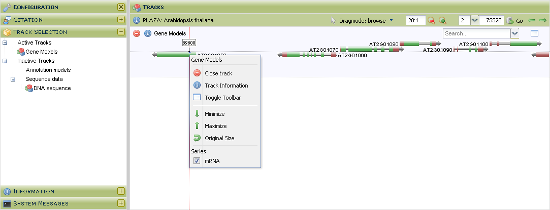
- Tool that allows users to visually inspect the genomes, with various features mapped onto the raw sequence.
-
To browse the raw genomic sequence and visualize various features (e.g. gene models) users can use the GenomeView genome browser.This genome browser has the following features:
- Individual tracks can be rescaled or even hidden. This flexibility allows users to study the data they are interested in and hide everything else.
- Currently only gene models and raw sequence data is viewable, but as more data will be added to the platform (e.g. cis-regulatory elements), these will become available in the genome browsers as well.
- This tool can be found on the organism pages. Alternatively a gene of interest can be visualized in the genome browser through the gene page (Toolbox → View → ...the gene in the Genome Browser ).
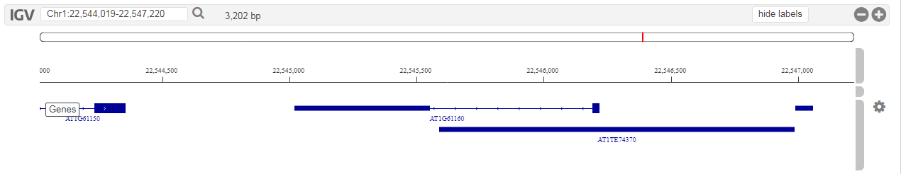
- Tool that allows users to visually inspect the genomes, with various features mapped onto the raw sequence.
-
To browse the raw genomic sequence and visualize various features (e.g. gene models) users can use the HTML5 IGV.js genome browser.This genome browser has the following features:
- Individual tracks can be rescaled or even hidden. This flexibility allows users to study the data they are interested in and hide everything else.
- Currently only gene models and raw sequence data is viewable, but as more data will be added to the platform (e.g. cis-regulatory elements), these will become available in the genome browsers as well.
- This tool can be found on the organism pages. Alternatively a gene of interest can be visualized in the genome browser through the gene page (Toolbox → View → ...the gene in the Genome Browser ).
Third party tools
Overview of the various used third-party tools within the PLAZA platform.
ATV / Archaeopteryx
Archaeopteryx (the successor to ATV) is a Java application based on the forester libaries for the visualization of annotated phylogenetic trees. It can be used both as applets (ArchaeopteryxA, ArchaeopteryxE) and as a standalone application.
canvasXpress
CanvasXpress is a standalone JavaScript library used for the visualization of charts, heatmaps, etc.
C-Hunter
C-Hunter is a clustering algorithm which incorporates knowledge of gene function derived from Gene Ontology ( http://www.geneontology.org ), with the organization of genes on chromosomes.
D3.js
D3.js is a JavaScript library for manipulating documents based on data. Various visualizations within the PLAZA framework are based on this library.
Genomeview
GenomeView is a Java application designed for genome browsing, gene model annotation and next-generation sequence data visualization and usage (e.g. in combination with gene annnotation). It can be both used as an applet or as a standalone application.
Jalview
Jalview (2009) is a fast Java multiple alignment editor and analysis tool.
MSAViewer
MSAs help researchers to discover novel differences (or matching patterns) that appear in many sequences. The MSAViewer is a modular, reusable component to visualize large MSAs interactively on the web.
PhyD3
PhyD3 is a phylogenetic tree viewer based on d3.js. It was developed as an alternative to Archaeopteryx inspired by d3.phylogram.js.